Difference between revisions of "Smartphone"
(→Smart Phone Screen Sizes) |
(→Smart Phone Screen Sizes) |
||
| Line 37: | Line 37: | ||
he viewport is the user's visible area of a web page. It varies with the device, and will be smaller on a mobile phone than on a computer screen. | he viewport is the user's visible area of a web page. It varies with the device, and will be smaller on a mobile phone than on a computer screen. | ||
| − | HTML5 introduced a method to let web designers take control over the viewport, through the <meta> tag. You should include the following <meta> viewport element (exactly as shown) in all your web pages: | + | HTML5 introduced a method to let web designers take control over the viewport, through the <meta> tag. Note that device width changes from portrait to landscape orientation of the device. You should include the following <meta> viewport element (exactly as shown) in all your web pages: |
<meta name="viewport" content="width=device-width, initial-scale=1.0"> | <meta name="viewport" content="width=device-width, initial-scale=1.0"> | ||
Revision as of 17:53, 2 October 2020
Contents
Full Title or Meme
A Smart Phone is a mobile device that can download Native Apps or Progressive Web Apps for contacting Web Sites as well as traditional mobile services like calling and messaging.
Context
- The computing power of a Smart Phone today is beyond that of any computer of 25 years ago. The connectivity of a Smart Phone is beyond that of any computer of 25 years ago. Now anyone of modest means can carry one with them nearly anywhere they want to go. Clearly society will feel the impact of this leap of technology. And its impact for personal Identity can only be guessed at.
- Pew research report Enhanced Patient Matching Is Critical to Achieving Full Promise of Digital Health Records. While the report's first solution was a universal health Identifier, they realize the blockers to that in the US and the second solution was patient oriented solutions like the Smart Phone.
Problems
- Smart Phones are valuable, both in their own right, and as access to user information. Theft is common.
- Telephone numbers can be reassigned by attacks against the telco self-service web sites or even the manned service locations.
Solutions
The Smart Phone will be provisioned with a variety of Native Apps when acquired by the user. A number of these apps, like email, will require the user to sign-in using some Identifier or Attribute Provider that also provides Authentication to unrelated third parties. For example Google Android or Apple iCloud services can be sued to sign-in to sites that recognize the OpenID Connect protocol that they use.
Smart Phone role in Authentication
The Smart Phone can serve a variety of roles in the process of Authentication of the user and Authorization of user access to User Information held on Web Sites. The major services are these:
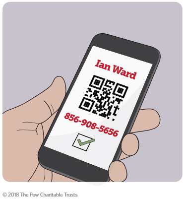
- The phone can store authentication information that is displayed to a reader in a physical device owned by the Relying Party. The information may include the user name only or user name and password or other authentication information.
- The phone supports blue tooth and payment NFC protocols that can be sued in a reader in a physical device owned by the Relying Party, or on the user's desktop computer.
- An Authentication Native App can be loaded onto the phone from existing Authentication providers, like Microsoft or Google.
Smart Phone Hardware Security
Smart Phone storage of user information
The Smart Phone can both collection user information from a variety of sources and then turn around and send that data to web sites that need the information. This process of sourcing and sinking data can be entirely on the Smart Phone itself, or in conjunction with a Web Site that acts as a back-end for a Web App on the phone.
Smart Phone Screen Sizes
- Media Genesis has a good list. also Device Atlas
- iPhone 5 640 x 1136 pixels 320 x 568 view port
- iPhone 7+ 1080 x 1920 pixels 414 x 736 view port
- Google N5X 1080 x 1920 Pixels 412 x 732 VP
- Google 3XL 1440 x 2960 Pixels 412 x 846 VP
- Samsung S7 1440 x 2960. pixels 360 x 640 VP
Premium phone can go somewhat higher
he viewport is the user's visible area of a web page. It varies with the device, and will be smaller on a mobile phone than on a computer screen. HTML5 introduced a method to let web designers take control over the viewport, through the <meta> tag. Note that device width changes from portrait to landscape orientation of the device. You should include the following <meta> viewport element (exactly as shown) in all your web pages:
<meta name="viewport" content="width=device-width, initial-scale=1.0">
